AI-Generated Posters Don’t Have to Be Horrible
 by ahsan
September 19, 2026
6 min read
by ahsan
September 19, 2026
6 min read
The problem is sameness, not imperfection
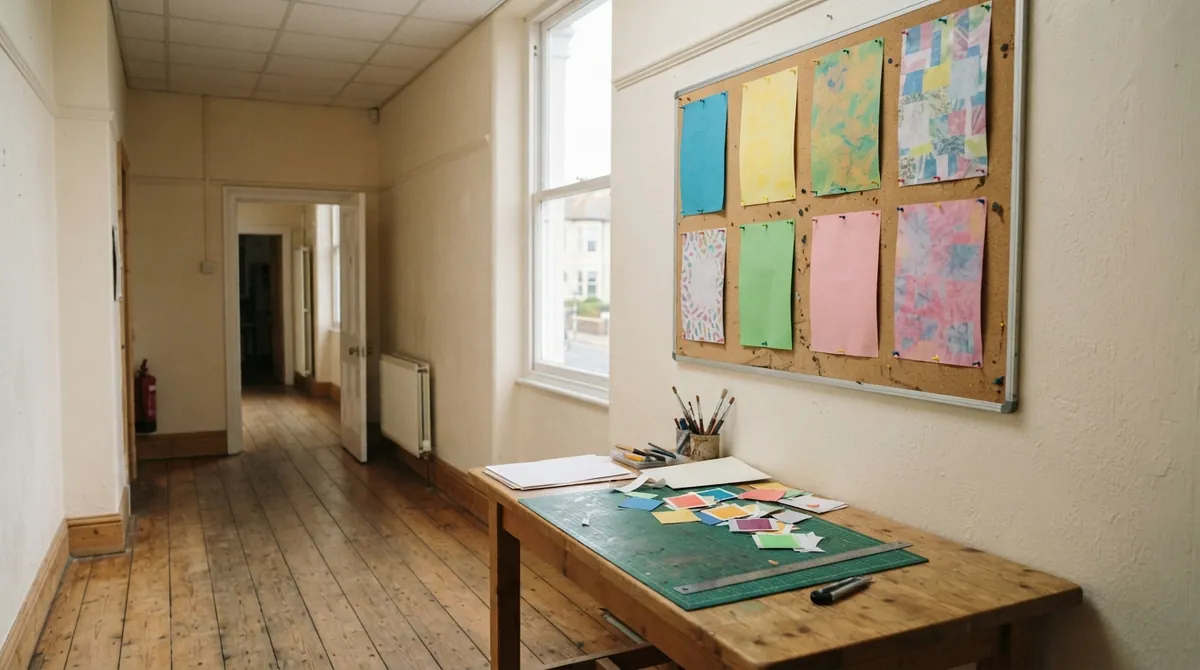
Walk past a row of community posters and you can spot a certain AI-generated look before reading the details: pastel paper, rounded lettering, soft floral shapes, bunting, and a little painted texture. Each poster may be competently made. After the twentieth version, the style becomes visual wallpaper.
The problem is not that a machine made one mediocre image. It is that thousands of people accept the first familiar answer. A generative image model is software that synthesizes a new picture from patterns learned from many examples. Give it an underspecified brief such as “spring fair poster” and it reaches for the strongest associations: flowers, friendly colours, craft-market lettering. That is not a mysterious failure. It is the model filling in missing art direction.
The practical question is: how do you make an AI-generated event poster look designed rather than generated? The answer starts before the first image. Give the system a job, a visual language, and boundaries.
Give the poster a job before giving it adjectives
Start with the poster’s purpose. Is it trying to stop people beside a noticeboard, make an event readable on a phone, or create a mood for a social media announcement? Those jobs may need different compositions, even when the wording is identical.
Then decide the format. An aspect ratio is the relationship between an image’s width and height, such as a tall poster or a square social graphic. Choose it before generating rather than cropping a finished image and discovering that the headline has lost its breathing room. For print, A3 is a common poster size; for online use, state the intended platform or pixel dimensions.
Write a short brief containing:
- the audience and purpose
- the exact wording that must appear
- one main visual idea
- the colour and mood
- things to avoid
Visual hierarchy means the order in which the eye notices information. A local event poster might need the event name first, the date and location second, and supporting details after that. If every line is large, bright, and decorated, nothing has priority.
A useful prompt might look like this:
Create a portrait A3 community event poster for a night market.

Exact text, with no additional words:
RIVERLIGHT NIGHT MARKET
Friday 12 July · 5–10 pm
Harbour Green
Food stalls · live folk music · free entry

Use a wayfinding-inspired graphic style: strong alignment,
large simple shapes, two flat colours plus black, and generous
empty space around the edges. Place the title in the upper third
and keep the lower third calm enough for later details.

Avoid pastel florals, bunting, handwritten fonts, fake logos,
photorealistic people, and decorative lettering.
This does not guarantee a perfect result. It gives the generator something more useful than “make it modern and fun.”
Use style names as handles, not magic spells
Words such as modern, bright, friendly, and professional describe a feeling, but they leave the visual decisions wide open. Style names work better when you explain what should be visible.
A Bauhaus-inspired poster suggests circles, rectangles, strong contrast, a limited palette, and bold sans-serif type. A risograph-inspired design suggests a small number of ink colours, visible paper grain, and slight misregistration where colour layers do not line up perfectly. Wayfinding design borrows from signs and maps, using clear alignment, icons, arrows, and information that can be understood at a glance.
The label is a shortcut, not a magic spell. Follow it with concrete instructions. Instead of asking for “a stylish spring poster,” ask for “an asymmetrical grid, one oversized orange circle, dark navy type, flat colour, and no gradients.” The second prompt gives the model decisions it can act on.
It also helps to explore styles separately. Ask for three different directions using the same event information: one geometric, one monochrome and typography-led, and one cut-paper collage. A poster that mixes brutalism, botanical illustration, 1990s rave graphics, and Japanese minimalism in one pass has not found a voice. It has collected adjectives.
Let the machine explore; keep type on a leash
Typography is the design of lettering, including its choice, size, spacing, and arrangement. It is where many AI posters reveal their weaknesses. Current image generators handle short headlines more reliably than early systems, and many can work from reference sketches or make targeted edits. Dense schedules, tiny legal text, long web addresses, and unfamiliar place names remain risky.
For a practical event poster, keep the generated wording short. Ask for a headline, a date, and perhaps a location. Leave a quiet area for the rest of the copy, then add it in a layout application. Combining generated artwork with separately typeset text is called compositing. It gives you control over spelling, line breaks, font size, contrast, and last-minute changes to the venue.
A prompt such as “render only the three lines supplied, with no invented labels or decorative words” can reduce clutter, but it is not a substitute for checking every letter. Do not spend twenty rounds trying to persuade an almost-correct image to fix one misspelled street name. Keep the artwork, replace the lettering, and move on.
Iterate like a designer, not a slot machine
The first render is a sketch with lighting. It is not a verdict on the idea.
Generate several compositions from the same brief, then compare them at thumbnail size. Look for the version with the clearest silhouette and strongest information order, not the one with the most detail. A poster has to work from across a room before anyone gets close enough to admire its texture.
Once you have a promising direction, change one variable at a time. Keep the composition but remove the grain. Keep the colours but move the illustration to the left. Preserve the headline and date while simplifying the background. Specific revisions such as “replace the flower with a black semicircle” are more useful than “make it less AI.”
This is where conversational image tools become genuinely helpful. You can preserve a chosen direction, sketch a rough layout, select one area, and ask for a controlled revision rather than rolling the entire design again. The more precise the change, the less likely the poster is to drift back toward the default template.
The finishing pass is where good becomes usable
A generated image is not automatically a print-ready poster. Before it goes on a wall, check the unglamorous details:
- Read every word against the original event brief.
- Confirm the date, time, venue, and entry information.
- Check the title and date at phone size and from a distance.
- Make sure text has enough contrast against its background.
- Leave a safe margin so important content is not cut off.
- Add bleed, which is extra artwork extending beyond the final trim edge, when the printer requires it.
Print a draft on ordinary paper. A design that looks elegant at full size on a bright monitor can turn a date into grey dust on a community noticeboard. Squinting at the draft is a useful test: can you still identify the event and the main practical detail?
Distinctive does not mean loud. A restrained poster with one unusual shape and excellent spacing can stand out more than a crowded image full of effects. Use historical design movements and observable properties as inspiration rather than asking for a direct copy of another designer’s work. The goal is a clear visual decision, not a costume.
AI-generated posters improve when you stop treating the generator as a vending machine for finished flyers. Let it produce possibilities, unusual compositions, and visual ingredients. Then take responsibility for the hierarchy, the wording, the margins, and the final choice. The machine can provide a hundred starting points; the design begins when one of them is edited with purpose.
Comments (0)
No comments yet. Be the first to respond!
Leave a Comment
Your comment will be visible after review.