How Bastardica Makes Cursed Fonts with OpenType
 by ahsan
September 25, 2026
5 min read
by ahsan
September 25, 2026
5 min read
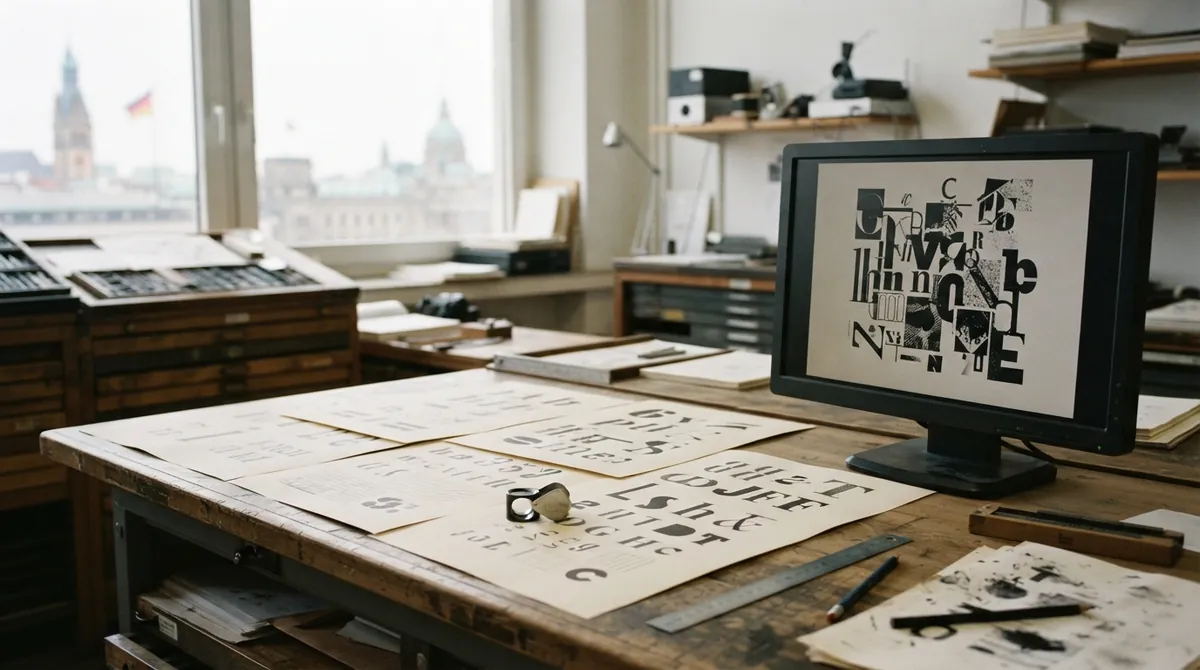
The moment a font starts misbehaving
Imagine opening a paragraph that looks like Times New Roman. Then the seventh glyph arrives in Arial. A few letters later, a serif stroke disappears, the rhythm jolts, and you realize the mistake is deliberate. That is the pleasure of a cursed font: it stays readable while quietly refusing to behave.
How do you make a font that changes every few letters without turning the text into an image? Bastardica takes the idea behind Times New Bastard and turns it into a browser-based font workshop. Choose a base font, choose a mix-in font, set a stride such as every seventh glyph, add scale, offset, or skew, and export a real TTF, OTF, or WOFF2 file.
Two typefaces enter, one odd typeface leaves
The word “glyph” matters here. A character is the item stored in text, such as the letter a; a glyph is the drawn shape used to display it. One character can have several glyphs depending on the typeface, language, or typographic feature.
Bastardica treats one font as the source of the ordinary shapes and another as a supply of replacements. With a stride of seven, the base font provides most glyphs while selected positions use the mix-in font. The idea looks something like this:
for each glyph position i:
 use the base glyph
 if (i + 1) % 7 == 0:
 use the mix-in glyph
That is a mental model, not the actual implementation. Font shaping does not run a small loop over your paragraph in the browser. Instead, the finished font contains rules that tell a text-shaping engine which glyph to substitute in context.
The visual controls make the result more intentional. Scaling a replacement glyph can bring its lowercase height closer to the base font. An X or Y offset moves it horizontally or vertically inside the font’s em square, the internal coordinate box used to size glyphs. Skew adds a slanted gesture without redrawing the outline.
The trick lives inside the font
OpenType is more than a file extension. It is a font format that can also carry layout instructions. When an application displays text, a text shaper converts Unicode characters into glyphs, positions them, and applies features such as alternate forms, kerning, and ligatures.
A ligature is a single glyph used in place of a sequence, such as the familiar fi combination in some typefaces. OpenType stores many of these substitutions in a Glyph Substitution table, usually called GSUB. Bastardica uses the same substitution machinery, placing its swaps in the standard liga feature that applications already know how to process.
That choice is what makes the result portable. The browser does not need a Bastardica plug-in or a custom script that replaces letters one by one. It sees a font with ordinary outlines and OpenType rules. Standard ligatures are normally enabled in browsers, although design applications and publishing tools can turn them off.
For a web page, explicit feature settings can make the intention clear:
.cursed-sample {
 font-variant-ligatures: common-ligatures;
 font-feature-settings: "liga" 1;
}
If a generated font looks completely normal in a particular application, the first thing to inspect is its ligature or OpenType feature settings.
Python in a browser tab
One of Bastardica’s more interesting engineering choices is that the font files do not need to be uploaded to a processing service. Pyodide brings Python into the browser through WebAssembly, a format that lets browsers run compiled programs. The application can then use fontTools, a Python library for reading, editing, and building font files.
The local workflow is easier to picture as a short pipeline. The page loads the base and mix-in fonts, examines their glyphs and metrics, applies the selected transformations, creates the substitution rules, and writes the requested output format. The preview can update as those settings change, while the source files remain in the page rather than traveling to a remote server.
This also explains why the tool feels more substantial than a visual filter. It is not painting a screenshot of text. It is modifying the ingredients that a real font uses: outlines, metrics, and layout tables.
Why prime numbers help the chaos
The moment you add three or more fonts, the schedule becomes a small piece of mathematics. Suppose one mix-in appears every fifth glyph and another appears every seventh. Their replacement points coincide every 35 positions because 35 is the smallest number divisible by both five and seven.
When two rules collide, the first font wins, but neither schedule stops working. The overlap is predictable rather than accidental. Choosing prime-number strides such as 5, 7, and 11 spreads the collisions farther apart because each number has no factors besides one and itself.
That gives you two useful modes of design. Close strides create a visibly crowded ransom-note effect. Wider, relatively prime strides produce a quieter font whose odd details emerge gradually across a paragraph.
Making the ugliness readable
Randomization is entertaining, but the best results usually involve a little cleanup. Start with fonts that share a rough weight or proportion. If a tall, heavy display face replaces a small serif letter, the result may look like a rendering error rather than a deliberate interruption.
Scale is often the first control to try. Then adjust the Y offset until the replacement sits on the same baseline as its neighbors. For mixed lowercase fonts, compare their x-heights, the height of the main body of letters such as x, rather than judging only their capital letters. Skew works best as a finishing touch; too much of it can make punctuation and narrow letters collapse into the surrounding shapes.
A pangram such as “The quick brown fox jumps over the lazy dog” is useful because it exercises much of the alphabet. Add numbers, punctuation, and accented characters before treating a design as finished. Those are the places where an otherwise convincing experiment often reveals gaps.
One font, several destinations
TTF and OTF are common font formats for desktop applications and print workflows. WOFF2 is a compressed web-font format, so it is usually the practical choice for a website. The important detail is that all three can carry the font’s outlines and OpenType behavior; the file format changes, but the typographic trick remains part of the font.
There is one serious consideration beneath the joke. Combining two fonts creates a derivative work, so the licenses of both source fonts matter. A typeface that is free to download may still have conditions around modification, redistribution, or commercial use. Bastardica does not add its own licensing terms, but it cannot erase the obligations attached to the fonts you bring into it.
The charm of Bastardica is that it turns a visual prank into a real piece of typography. OpenType was built to handle sophisticated substitutions and positioning; this tool uses that machinery for controlled misbehavior. Once the weirdness becomes a rule inside the font, a paragraph can carry its own little glitch wherever the font is supported.
Comments (0)
No comments yet. Be the first to respond!
Leave a Comment
Your comment will be visible after review.