Iosevka: A Monospace Font You Can Tune for Code
 by ahsan
October 14, 2026
5 min read
by ahsan
October 14, 2026
5 min read
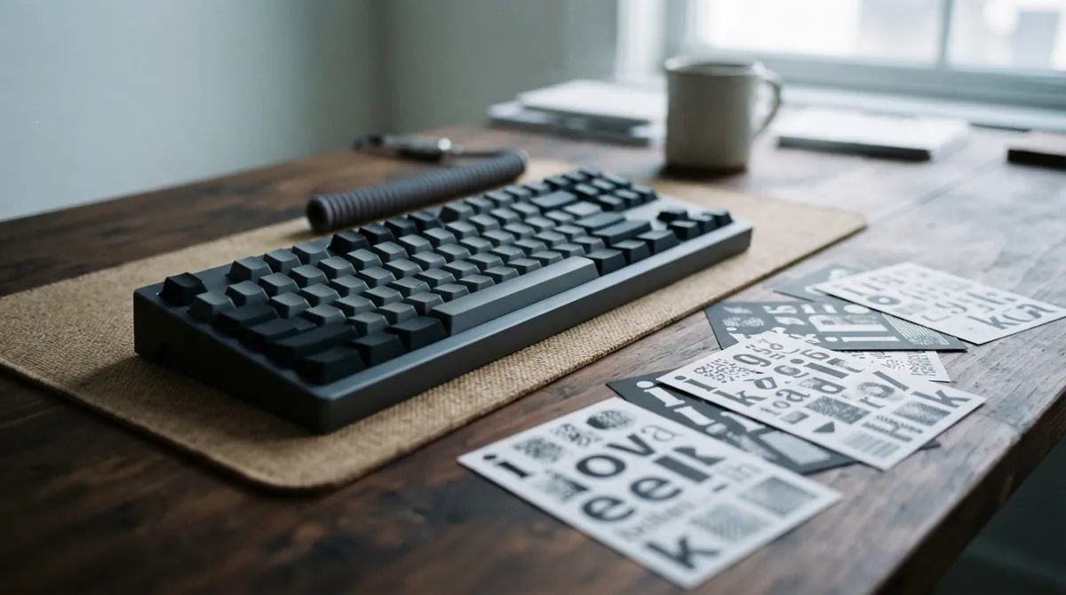
Your editor is open, a terminal is glowing beside it, and the code looks correct—but after an hour, every brace feels a little cramped. A font cannot fix a confusing API, yet it can change how much visual effort your eyes spend separating symbols. Iosevka is built around that practical problem: it is an open-source typeface family for code, terminals, and technical documents, with sans-serif, slab-serif, monospace, and quasi-proportional branches rather than one fixed look. (typeof.net)
What makes a programming font feel comfortable after six hours in an editor? With Iosevka, the answer begins with the shape of the page itself.
A narrow grid for dense code
A monospace font gives every character the same horizontal cell. The lowercase i occupies the same amount of space as W, even though the drawn shapes use that space very differently. A glyph is the visible drawing of a character, and Iosevka places each glyph inside a predictable grid so code, logs, tables, and terminal output stay aligned.
That regular spacing is especially useful when you are comparing two versions of a file or scanning a long command line. Indentation remains visible. Repeated operators do not drift across a row. The design feels less like a page of prose and more like a carefully marked coordinate system.
Iosevka’s standard monospace style is deliberately compact: its glyph cells are exactly one-half of an em wide. An em is a typographic measurement that scales with the font size, so this relationship remains consistent as you resize text. The result is a slender appearance that can fit more columns on the same screen. When you want more breathing room, the Extended width provides a roomier alternative to Normal.
One family, several personalities
A typeface family is a collection of related designs that share an underlying visual system. Iosevka uses that idea generously. The regular Iosevka branch is a sans-serif design, meaning its letters do not have the small finishing strokes found on traditional serif type. Iosevka Slab adds sturdy, block-like serifs, giving code and technical notes a more mechanical, printed character.
The family also includes two versions designed with terminal behavior in mind. Term adjusts symbol widths for text interfaces that organize content into fixed columns. Fixed goes a step further by disabling ligatures. A programming ligature is a font feature that displays a sequence such as =>, !=, or >= as a combined visual shape. That can make operators easier to recognize in an editor, but literal symbols are sometimes preferable in terminals, debugging output, or environments with limited font-feature support.
For writing that is not bound to a strict character grid, Iosevka offers Aile and Etoile. These are quasi-proportional designs, which means their spacing is more natural for ordinary paragraphs while still belonging to the same broader family. Aile is sans-serif; Etoile uses the slab-serif direction. The project’s current documentation also lists coverage across Latin, Greek, some Cyrillic, IPA symbols, and 248 supported languages. (github.com)
The real trick is customization
Many coding fonts give you regular, bold, and italic, then stop. Iosevka treats those choices as the beginning. Its official packages include nine weights from Thin through Heavy, two monospace widths, and three slopes: Upright, Italic, and Oblique. You can move from a delicate editor setup to a heavy presentation style without leaving the family.
The more unusual feature is the collection of character variants. Iosevka exposes 146 configurable characters and 19 stylistic sets. A stylistic set is an OpenType font option that swaps particular letter or symbol designs without requiring a separate font family. OpenType is the font technology that allows these alternate shapes, ligatures, and other typographic behavior to travel with the font file.
That means you can adjust details that programmers stare at all day: the shape of a, g, r, or f; the tail on t; the form of zero; the distinction between capital I, lowercase l, and the number 1; or the angle of an operator. Some presets echo familiar coding fonts, while the customizer lets you combine individual choices into a more personal build.
A basic setup might look like this:
.editor {
 font-family: Iosevka, monospace;
 font-size: 15px;
}

.terminal {
 font-family: 'Iosevka Fixed', monospace;
 font-variant-ligatures: none;
}
The snippet is not a complete installation recipe. It shows the main decision: use the broad editor family when you want its typographic features, and choose a Fixed variant when literal terminal output matters more than decorative substitutions.
Choosing a starting point
The official release packages are the least confusing way to begin. As of October 14, 2026, the project’s release page lists version 34.9.0, published on September 26, 2026. That release adds new character coverage and additional shape variants for several Greek letters, a useful reminder that this is an actively developed type project rather than a frozen font archive. The repository also links the SIL Open Font License 1.1. (github.com)
Start with the job instead of the entire option list:
- Choose Iosevka Normal for a compact code editor.
- Try Iosevka Extended when punctuation and nested expressions feel crowded.
- Use Iosevka Term or Fixed for terminal-heavy work.
- Pick Iosevka Slab when you want stronger serif shapes.
- Try Aile or Etoile for notes, documentation, and mixed technical prose.
After that, test the font with text you actually read. A short specimen such as this exposes more than a polished alphabet sample:
0 O o 1 I l | { } [ ] =>!= <= >=
const value = items[i]?? defaultValue;
Look for quick recognition rather than abstract beauty. Can you distinguish the letters at a glance? Do braces remain clear at your normal editor size? Does the terminal still feel calm when a log fills the screen? Those details matter more than whether a specimen page looks impressive at a large size.
Iosevka’s strength is not one universally perfect shape. It is the ability to treat typography as part of your working environment. You can keep the compact monospace grid, switch to terminal-safe behavior, add slab-serif character, or build a set of letterforms that makes your own code easier to parse. The best version is the one that quietly removes friction every time you return to the editor.
Comments (0)
No comments yet. Be the first to respond!
Leave a Comment
Your comment will be visible after review.