Theranos.world: Building an Interactive Archive
 by ahsan
October 09, 2026
5 min read
by ahsan
October 09, 2026
5 min read
The page that behaves like a room
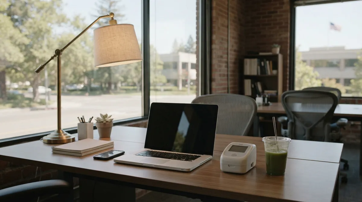
Open Theranos.world and you do not land on a conventional article. You enter a quiet office: a desk, a lamp, a MacBook, an iPhone, a green drink, and a compact Theranos instrument. The interface tells you to sit, look around, return to the desk, and open files. For a few seconds, the subject is not a paragraph about a scandal; it is a place waiting to be inspected.
That is why the project is interesting from a technical perspective. Theranos.world is an interactive archive: a website that wraps documents and records in a navigable environment. It borrows the grammar of a game—camera movement, objects, actions—without asking you to learn a game. The result feels closer to entering a scene than scrolling through a timeline.
The approach also fits the subject. Theranos became famous for a promise about a small blood-testing device, while the truth of what the technology could do was contested, documented, and eventually examined in court. A simulated office lets the audience feel the distance between polished presentation and the files behind it. The lesson is not that a 3D room makes history more trustworthy. It is that the room can give evidence a useful context—provided the design explains what is original, reconstructed, or synthetic.
Movement is a state machine
A spatial website needs memory. After you sit down, the camera should know where you are. After you open the laptop, the desk should not forget that it is open. This is a state machine, which means a small set of named situations and the rules that move the experience from one situation to another.
You do not need a huge game engine to model it. Even a plain JavaScript object can make the idea visible:
const states = {
 desk: { camera: 'desk', focus: null },
 laptop: { camera: 'laptop', focus: 'records' },
 phone: { camera: 'phone', focus: 'messages' },
 device: { camera: 'device', focus: 'instrument' }
};

function enter(name) {
 const next = states[name];
 if (!next) return;

 moveCameraTo(next.camera);
 openPanel(next.focus);
}
The snippet is not a complete scene. It demonstrates the important boundary: interaction changes state, and the renderer displays that state. With that separation, the same desk can support a mouse click, a touchscreen tap, a keyboard shortcut, or a screen-reader command without four different versions of the logic drifting apart.
The laptop is not decoration
The simulated Mac desktop and phone are more than period details. They are containers for narrative. A presentation belongs in a presentation app. A text message belongs on a phone. A record found through the desk feels different from a record presented as a floating card because the surrounding object supplies a little context before the text begins.
That only works if the archive has a clean data model. A data model is the agreed shape of information in software. Instead of hard-coding every message into a button, store each item once:
{
 id: 'record-042',
 kind: 'email',
 date: '2015-09-30',
 title: 'Subject line',
 body: 'Record text goes here.',
 source: 'court exhibit',
 displayIn: ['laptop', 'records-menu']
}
Now the same record can appear in the laptop, a search view, or a later chapter without being copied three times. The source field is especially important. Provenance—the history of where an item came from and how it was changed—should travel with the content, not live in a forgotten credits page.
Let the scene load in layers
A room full of high-resolution textures, device models, lighting, and document previews can punish a phone or a slow laptop. The usual answer is progressive loading: send the smallest useful version first, then fetch detail as the visitor moves toward it.
A practical build might show a lightweight office shell, load close-up laptop textures only when the laptop receives focus, and fetch large document images after the visitor opens a record. Lazy loading means delaying a resource until it is needed. WebGL, the browser technology commonly used for GPU-accelerated graphics, can draw a 3D scene, but it does not remove the need to manage file size, memory, and battery use.
The best performance trick is often editorial. Do not preload every document because it exists. Decide which object a visitor is likely to inspect next, and make that path fast. Everything else can arrive a moment later.
Reconstructed interfaces need labels
An immersive archive can feel authoritative simply because it has physical details. A familiar desktop, a dated phone screen, and a machine on a desk create the impression that you are looking at the past itself. That impression is powerful—and risky.
The interface should distinguish at least four things: an original record, a transcription, a recreated interface, and synthetic material made for the experience. Theranos.world’s visible SYNTHETIC Records label points in the right direction. A stronger archival pattern would pair each item with its date, source, short transformation note, and a clear indication when wording has been normalized for display.
This is not bureaucratic overhead. It is part of the story. The historical tension around Theranos came from the gap between what a polished demonstration suggested and what the underlying system could actually deliver. A trustworthy interactive archive should not recreate that gap by hiding its own editorial choices.
Immersion should have an exit
The instructions to press Escape, tap to sit, drag to look, or pinch to zoom are useful because they explain the verbs of the space. Still, a spatial interface should never be the only route through the material.
Every important action needs a keyboard equivalent. Interactive objects should be real buttons or links rather than invisible click zones. Text inside a laptop or phone should remain selectable, readable by assistive technology, and available in a flat list view. Motion should respect the browser’s reduced-motion preference, and the experience should remain understandable when the visitor never enters the 3D scene at all.
That fallback is not a lesser version. It is the archive’s safety net—and often the fastest way for a reader to compare records.
A useful pattern for future projects
A project like this can be organized into four cooperating layers:
- a scene layer for the office, camera, lighting, and object placement;
- an interaction layer for sitting, standing, opening, closing, and navigation;
- an archive layer for records, metadata, search, and relationships;
- an evidence layer for provenance, corrections, and accessibility alternatives.
The separation keeps the spectacle from swallowing the substance. Designers can change the room without rewriting the archive. Editors can correct a date without touching the camera. Developers can add a phone or another document view without inventing a second copy of the same record.
How do you build a website that feels like a room? You give the visitor a believable surface, then make the underlying structure more disciplined than the surface suggests. Theranos.world works as a compelling idea because it turns browsing into inspection. Its deeper lesson is quieter: immersive web design earns trust not through atmosphere alone, but through clear states, careful loading, accessible controls, and honest labels about where every piece of evidence came from.
Comments (0)
No comments yet. Be the first to respond!
Leave a Comment
Your comment will be visible after review.