Car Touchscreens Are Cheap—And That’s the Real Problem
 by ahsan
July 06, 2026
6 min read
by ahsan
July 06, 2026
6 min read
A morning drive, and one tiny problem
Picture your morning routine: coffee in hand, seatbelt click, mirrors adjusted, then—before you’ve even merged—your car asks for attention. The climate control is now a screen. Volume is now a screen. Navigation is now a screen.
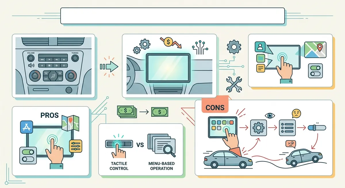
So why do cars keep getting bigger screens and fewer knobs? The frustrating answer is that touchscreens can be good at the job they’re designed for—presenting information and letting you pick options. But many automotive touchscreens end up being “good enough” for comfort and “bad” for safety-critical behavior, largely because the industry adopted them for business reasons: cost, assembly simplicity, and the ability to sell features later.
First, the good news: touchscreens aren’t automatically worse
Touchscreens bring real strengths to car interfaces.
A touchscreen is a display that detects your finger position. That means one piece of hardware can show different layouts depending on what you’re doing—radio one minute, climate the next—without swapping physical parts. This flexibility is a huge win when cars are stuffed with features.
From a user experience perspective (UX, short for user experience, meaning how usable and satisfying an interface feels), touchscreens can also reduce certain kinds of “button hunting.” In classic research comparing touchscreen and button-based in-car tasks, participants often completed tasks faster and made fewer driving errors when the task was performed via touch interfaces, even if there were tradeoffs like occasional longer glances.
Now here’s the twist: those studies typically measure specific tasks in controlled settings. Real driving is messy. Real drivers are tired, distracted, or multitasking. And real cars often use touchscreen menus for controls that used to be operated with muscle memory.
The safety problem isn’t touch—it’s where and how touch is used
The key issue is not “touch is bad.” The key issue is that touching a glass UI takes attention at the worst possible time.
A touchscreen interaction usually requires a chain: you visually identify the control → you aim your finger → you confirm the action occurred. That “confirm” step matters, because capacitive inputs (capacitive buttons/surfaces detect finger position electrically) can be sensitive, and some systems provide limited feedback. Limited feedback means you may not instantly feel whether the system registered your input.
Research from the University of Washington and Toyota Research Institute studied how cognitive load (cognitive load is the mental effort your brain spends on a task) interacts with touchscreen use while driving. Their findings support the idea that touchscreen-based secondary tasks can meaningfully affect distraction patterns and degradation in driving/touch performance. In other words, touchscreens can be fine when used lightly—but many modern interiors lean on touch for too many core functions.
And placement matters. A 2008 driving-simulator paper examined how monitor distance/position affects task time and driving performance. Longer reach and less convenient placements can increase time-to-complete tasks—exactly the kind of “small delay” that becomes dangerous when you’re doing it at the same time as steering, braking, and scanning.
So the real question becomes: what does a car ask you to touch while you’re still actively driving?
Why the industry chose touchscreens anyway
Here’s the part that feels like heresy if you grew up loving physical controls.
Physical controls—buttons, knobs, toggles—require individual mechanical parts and specific wiring for each function. Every additional button tends to mean more parts, more assembly time, and more variability in hardware.
Touchscreens, by contrast, let manufacturers consolidate controls into fewer physical components. One display can represent many “buttons” in software. The car can also update the interface with changes in software rather than new hardware. That isn’t just a convenience; it’s a manufacturing strategy.
Cost: touchscreens reduce the number of unique parts
Ferrari’s CEO Benedetto Vigna has publicly argued that touch controls are dramatically cheaper than physical buttons—reportedly “50%” cheaper to manufacture—reflecting a supplier advantage in cost structure.
Even if you ignore Ferrari-level numbers, the logic scales down: if a manufacturer can replace dozens of discrete controls with fewer touchscreen and steering-wheel inputs, they reduce complexity across production, tooling, and variant management.
Revenue: the screen is also a software platform
A touchscreen is more than hardware—it’s a distribution channel for software.
Feature packaging becomes easier when the interface is virtual. That opens the door to subscriptions and paywalled capabilities. Tesla’s shift toward paywalled feature tiers (for example, changing which driver-assistance features are included by default) illustrates a broader industry pattern: software-defined features can be rearranged, metered, or locked behind recurring payments without redesigning the physical cabin.
In plain language: touchscreens aren’t only being used because they feel modern. They’re being used because they help companies build “software products” inside cars.
Mazda’s 2026 CX-5 is a telling example
To see how far this philosophy has spread, look at the 2026 Mazda CX-5.
Mazda describes the 2026 CX-5’s interface as touchscreen-forward, including a larger display and the ability to operate functions through the screen, with voice and steering-wheel controls used as alternative input paths. Crucially, Mazda also frames the design around minimizing distraction (even while moving more core controls into touch). (mazdausa.com)
That combination—touch-forward design plus “we’ll use voice and steering wheel controls to reduce distraction”—is common. It’s not that the companies don’t think about safety. It’s that the cabin layout is being shaped first by cost and flexibility, and safety becomes something the system compensates for via interaction design.
The hidden downside: tactile memory disappears
Physical buttons and knobs can be operated with tactile memory: muscle memory stored in your hands. You learn that volume is “there,” temperature is “that way,” and you can do it with minimal visual checking.
When a climate knob becomes a touch surface, you lose immediate haptic confirmation. (Haptic feedback is physical sensation—vibration, clicks, resistance—that tells your brain something happened.) Some cars try to replace tactile feedback with on-screen highlights or subtle vibration, but the sensation is still different from a real detent click, and it depends on the exact software implementation.
So even if touchscreens are statistically “okay” in controlled studies, the daily experience can become: more glances, more searching in menus, more uncertainty about whether the input registered.
That uncertainty is the enemy in driving. Drivers don’t need perfect menus; they need consistent, low-attention control.
What “good” touchscreen design would require
A responsible automotive UX would treat touchscreens like powerful tools—not like the default steering-wheel of the entire cabin.
That means:
- Touch for things that can wait: audio browsing, settings where a brief delay is tolerable.
- Physical or hard-to-fail inputs for primary functions: defrost, wipers, and critical vehicle state should be controllable without deep menu navigation.
- Large targets and minimal steps: if a control requires multiple taps, it’s behaving like a tiny form-filling task while you’re driving.
- Meaningful feedback: a user should feel (or clearly see) confirmation instantly.
Mazda’s own approach of combining touch with voice and steering-wheel alternatives is a step in this direction, acknowledging that touch alone isn’t enough for all situations. (mazdausa.com)
The conclusion: “cheap” explains the trend better than “better”
Car touchscreens can be better at presenting options and consolidating UI layouts. But the modern “touchscreen-forward” push often prioritizes cost, assembly simplicity, and software monetization. That trade-off shows up in distraction risk, loss of tactile memory, and the increasing amount of time drivers must visually and mentally manage the interface.
Touchscreens aren’t the enemy. Cheap touchscreen-first design is.
Comments (0)
No comments yet. Be the first to respond!
Leave a Comment
Your comment will be visible after review.