Good Tools Are Invisible (and Why That Matters)
 by ahsan
July 10, 2026
7 min read
by ahsan
July 10, 2026
7 min read
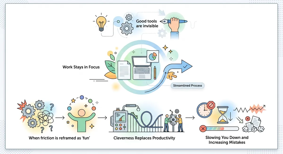
Picture the moment you open your editor to start work.
Your hands find the keys, your eyes track the cursor, and the program doesn’t demand attention—it disappears. That’s the ideal: a tool so well-matched to how you think that you stop thinking about the tool. But the minute friction shows up—an annoying workaround, a missing feature, a workflow detour—the illusion breaks. The program becomes “something you deal with,” not the invisible surface where your work happens.
This is what people mean when they say “good tools are invisible.” Not because the tool is featureless, and not because everyone should use the same editor. The goal is that the tool fades into the background while your actual output stays in the foreground.
The trap: calling workarounds “fun”
A common habit in developer communities is to treat a tool’s limitations as a playground.
When a text editor can’t do a transformation you need, someone eventually reframes the struggle as a game: write a clever macro, discover a niche command sequence, hack together a plugin, or build a “puzzle” out of the missing functionality. The story sounds appealing—until you measure what it costs in time, mistakes, and cognitive load.
A good tool doesn’t demand that you cosplay as a systems engineer just to perform normal editing. It doesn’t ask you to celebrate inconvenience as evidence of competence. Instead, it should make the default path match what you’re trying to do.
Here’s the key distinction: being engaged by cleverness is not the same as being productive.
Feel productive vs be productive
Tools create a sensation, and sensations are persuasive.
When you spend time wrestling with a fiddly workflow, you often feel clever—like you earned the result through skill. That feeling can be addictive, especially when the workaround is genuinely interesting. But the test for productivity is not how heroic the process felt. The test is wall-clock time (real elapsed time) and quality.
In other words, the question that matters is not “Did this make me feel like a hacker?” but “How fast did this get done, and how often did it go wrong?”
A workaround that costs minutes today can quietly become hours across a week, especially when it appears repeatedly. The invisible-tool ideal refuses to treat repeatable friction as entertainment.
Editors as a case study: macros, multi-cursors, and bulk edits
Text editors are perfect for seeing this dynamic because they sit directly between intent and output.
Consider two common approaches for transformations:
- Macros: a recorded sequence of actions (keystrokes/commands) that you replay later. Macros shine when the sequence is stable and truly reusable.
- Multi-cursors: an editing mode where multiple insertion points exist at the same time, so you can apply the same edit across several places simultaneously.
Both can be powerful, but they fit different situations. Multi-cursors often map more directly to what you mean: “Do this change in all the places that match my visual intent.” Macros often map to what the editor happens to support: “Repeat these steps exactly like before.”
When people claim a limitation as a feature, they usually do one of two things:
- They pick a rare workflow where the workaround shines and ignore the common ones.
- They measure the “fun” of building the workaround instead of measuring the cost of using it.
A macro built for a one-off refactor can be slower than a tiny script or a quick visual edit. Worse, the macro may become maintenance baggage: it’s fragile, it assumes a specific structure, and it’s easy to forget why it exists.
A good tool tries hard to make the default operation match the task. It doesn’t force you to convert simple intentions into elaborate rituals.
Why tool choice turns into identity
Debates about editors don’t stay technical for long—because tool choice becomes identity.
Once a tool is tied to who someone feels they are, admitting flaws starts to feel personal. At that point, criticism isn’t just “that feature is missing.” It becomes “you’re wrong about yourself.” So people defend limitations as if they were virtues.
This is how “hacker vibe” turns into tribal signaling. The style of working—keyboard-first, terminal-first, command-driven—becomes proof of belonging. In that environment, friction is rebranded as authenticity.
The invisibility goal is incompatible with that dynamic. Invisibility requires honesty: if the tool gets in the way, the tool should improve or be replaced.
Terminal UIs vs GUIs: the real issue is navigation quality
Another place where the “invisible tool” idea gets misunderstood is the terminal-vs-GUI argument.
A TUI (text-based user interface) is a user interface that renders interaction primarily with text in a terminal-like environment, often using keyboard navigation to move between elements. A GUI (graphical user interface) uses visual widgets like buttons, panels, and windows, usually controlled by both keyboard and pointing devices (like a mouse).
The common criticism of GUIs is that you “can’t navigate them with the keyboard alone.” But that’s rarely a property of GUIs themselves. It’s usually a property of how specific applications implement keyboard support.
Designing a keyboard-navigable GUI is not conceptually impossible; it’s a tooling and discipline problem. If a UI makes keyboard navigation clumsy, the community mistakes that clumsiness for an inherent limitation of the entire category.
That’s the same mistake as the editor-macro story: it turns a product’s current shortcomings into a doctrine.
An invisible-tool mindset cares about the quality of the interaction, not the aesthetic of the interface layer.
Defaults beat configuration-as-a-lifestyle
Good tools don’t just provide features—they provide defaults.
A default is the behavior and configuration a tool uses when you haven’t explicitly customized anything. Ergonomic defaults mean the common case works well with minimal thinking. Escape hatches—advanced settings, plugins, and overrides—exist for the times you truly need to deviate.
When a tool’s design philosophy pushes maximal configuration, it tends to shift effort from “making progress” to “maintaining an environment.” And maintenance can easily become an identity: you start collecting tweaks like trophies.
But invisibility means you shouldn’t have to keep proving your setup. You should spend time producing work, not negotiating basic usability.
There’s also a psychological twist here: optional complexity can create a sense of safety. If you can configure everything, you might feel in control—even when the configuration itself becomes the hidden cost. In practice, you end up paying with time and attention.
The invisible standard: keyboard flow, visual feedback, and low error rates
Invisible tools share a few practical traits.
First, they reduce context switching. If your editor’s shortcuts align with the rest of your OS and your brain expects the same muscle memory across apps, you lose fewer seconds to “re-orienting.” Second, invisible tools offer fast visual feedback. When the editor shows exactly what will happen before you commit changes, mistakes become rarer.
Third, they minimize “setup overhead.” If accomplishing the task requires assembling a workaround every time, that overhead becomes a tax. Invisible tools try to make common operations the path of least resistance.
A surprisingly reliable way to detect invisibility is to watch error rate.
When friction is hidden, mistakes tend to be hidden too—because the workflow is stable. When friction is visible, people compensate by double-checking, doing extra steps, or reverting. That’s when you feel the tool rather than the task.
Measuring the right thing: wall-clock time and mistakes
The resolution isn’t to reject cleverness.
It’s to stop confusing cleverness with throughput.
A tool can be “smart” and still be the wrong fit if it forces you into elaborate ceremony for everyday edits. Likewise, a tool can be unglamorous—boring even—and still be excellent because it makes the right actions fast and reliable.
So the invisibility test looks like this:
- Can you do the common actions quickly without building new machinery?
- Does the workflow produce fewer mistakes, not just impressive results?
- Does the tool stay out of your head during normal work?
If the answers are yes, the tool becomes invisible. If the answers are no, the tool isn’t failing morally—it’s failing at the job you actually need it to do.
And that’s why this question matters for every editor, terminal app, IDE, or UI you adopt: Why does a tool stop feeling invisible the moment it gets in your way?
Conclusion: tools should amplify work, not perform drama
The “good tools are invisible” idea isn’t anti-fun or anti-hacking. It’s pro-output.
A good tool disappears into background attention because it matches real tasks with thoughtful defaults, consistent interaction patterns, and low-friction ways to perform bulk operations. When a limitation turns into a puzzle people celebrate, the community is often praising the sensation of effort instead of the reality of productivity.
In the end, invisibility is an ethical design goal: a tool should help you think and create, not force you to keep managing its shortcomings.
Comments (0)
No comments yet. Be the first to respond!
Leave a Comment
Your comment will be visible after review.